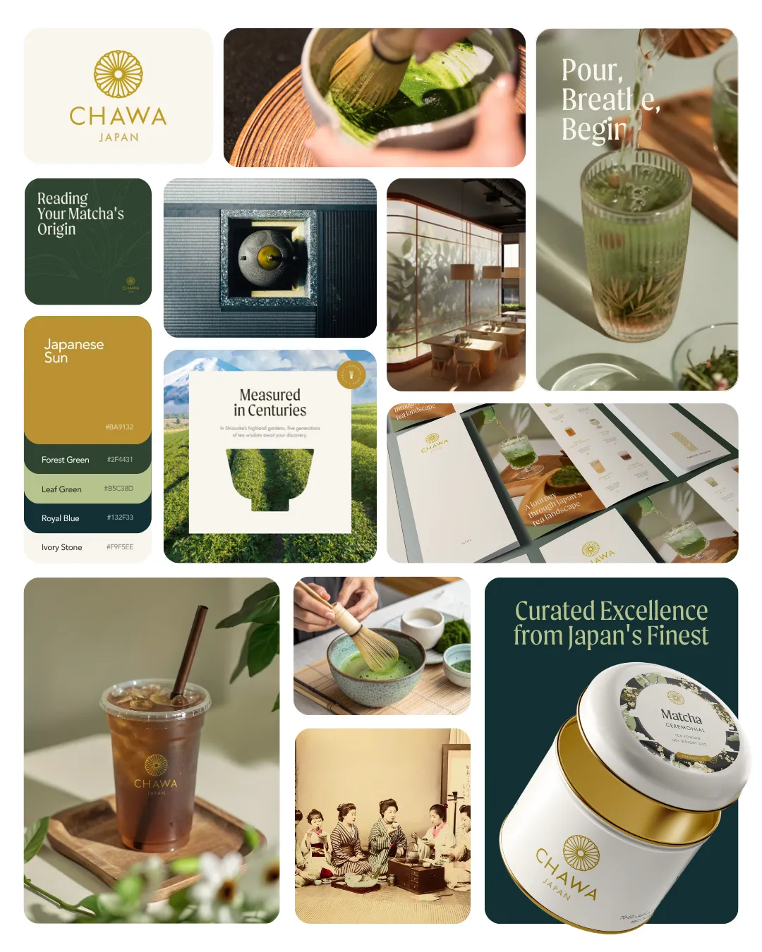

Food and Beverage Branding: Build a World, Not a Logo
Food and beverage branding is the strategic creation of immersive brand worlds that connect products to people through cohesive design, storytelling, and sensory experience across every touchpoint. The strongest F&B brands do not stop at a logo or a label. They build systems: strategy, naming, visual identity, packaging, environment, and rollout working as one. Crown Creative’s work at St. Regis Cap Cana proves the point. The agency developed nine distinct dining identities unified by a single nature-inspired narrative, showing that scale and coherence are not opposites.
1. What are the key elements of food and beverage branding?
Effective F&B branding is a joined-up system, not a collection of assets. Strategy, naming, visual identity, and rollout must connect at every stage. When one element is missing, the whole experience fractures.
The core elements are:
Brand strategy: Positioning, audience definition, and the story you commit to telling
Naming: Names that carry meaning, sound right, and work across languages and contexts
Visual identity: Color, typography, illustration, and photography working as a system
Packaging: The physical expression of the brand, built for shelf impact and tactile resonance
Environment and signage: Spaces that extend the brand from the screen to the room
Digital and social presence: Channels where the brand voice and visual language stay consistent
Rollout and implementation: The coordinated process that brings every element to market together
Sensory coherence ties all of these together. The weight of a menu, the texture of a label, the sound a package makes when opened: these details are not decoration. They are brand signals. Luxury hospitality brands have understood this for years. The lesson now applies equally to snack brands, juice lines, and pasta concepts competing for attention on crowded shelves.
Pro Tip: Map every consumer touchpoint before you design a single asset. The gaps between touchpoints are where brand equity leaks.
Storytelling depth is the final layer. Local inspiration, founder narrative, cultural reference: these give a brand something to say beyond the product itself. Brands with a clear story attract loyal customers and earn editorial coverage that paid media cannot buy.
2. How can snack brands stand out with snack packaging design?
Snack packaging design is the first and often only conversation a brand has with a shopper. Most snack categories are dominated by visual clichés: aggressive typography for jerky, clinical minimalism for wellness bars, generic green for anything “natural.” Breaking those conventions is not a risk. It is the strategy.
“Snack packaging that evokes texture and taste visually encourages deeper engagement and social sharing potential on platforms like Instagram. The package is the product’s first sensory promise.”
Buffs, a modern jerky brand, rejected macho category clichés entirely. The design uses bold color blocking, oversized wordmarks, and a mascot-driven visual language that reads as playful and confident rather than aggressive. The result is a package that photographs well, stands out at shelf, and signals a different kind of brand personality.
The techniques that work in snack packaging design include:
Visual Flavor Mapping: Translating taste and texture into color, shape, and illustration before a word is read
Color blocking: High-contrast palettes that create instant shelf recognition from three feet away
Character-driven design: Mascots and illustrated personalities that build emotional connection and recall
Playful typography: Letterforms that carry energy and match the product’s personality
Minimal composition: Fewer elements, more impact, cleaner hierarchy on pack
Snack packaging ideas that work on Instagram also work at retail. The two channels reward the same qualities: clarity, personality, and a visual promise the product can keep. If your packaging needs explanation, it needs redesign.
3. Why does sensory coherence matter in premium F&B packaging?
Premium F&B packaging communicates quality before the product is tasted. The materials, finishes, and physical behavior of a package are brand signals that operate below conscious awareness. Shoppers feel the difference before they articulate it.
Solnuts Crunchers demonstrates this precisely. The design uses matte and gloss varnishes alongside vintage typography to communicate crunch and quality through touch and sight simultaneously. Halftone patterns and fragmented typography visually interpret the product’s texture, so the consumer understands the eating experience before opening the bag.
Sound is an underused branding asset. Crakky, a snack brand built around the concept of crunch, uses packaging that crackles audibly when handled. That sound reinforces the brand name, the product promise, and the sensory expectation in a single gesture. It is the kind of detail that earns word-of-mouth without a media budget.
The material toolkit for premium snack and beverage packaging includes:
Matte lamination: Signals restraint and quality; photographs well in natural light
Spot UV or gloss varnish: Creates contrast and draws the eye to key brand elements
Embossing and debossing: Adds tactile depth that communicates craft and attention to detail
Structural design: Unusual formats, closures, and proportions that make a package memorable in hand
Sound engineering: Foil crinkle, magnetic closure, or deliberate material choices that create an auditory brand cue
Sensory cues in packaging are a strategic branding asset beyond simple containment. Brands that invest in material sophistication consistently command higher price points and stronger consumer loyalty than those that treat packaging as a cost to minimize.
4. How to create cohesive branding across multiple F&B venues or products
Multi-venue and multi-product F&B brands face a specific challenge: each concept needs its own personality, but the portfolio must read as a family. Getting this wrong produces either a bland sameness or a disconnected collection of identities that confuse consumers and dilute brand equity.
The solution is a shared narrative system. St. Regis Cap Cana’s nine dining concepts are individually distinct but cohesively connected by a “Rooted in Nature” story and a shared visual language. Each venue has its own name, palette, and personality. All of them speak the same design language at the level of typography, illustration style, and material choice.
Here is a practical sequence for building a connected F&B portfolio:
Define the master narrative. Identify the single story or value that all concepts share. This becomes the invisible thread.
Establish a shared design system. Set rules for typography, color logic, illustration style, and material palette that apply across all concepts.
Differentiate at the concept level. Give each venue or product its own name, hero color, and personality within the system.
Align the rollout. Coordinate design and production so all concepts launch with the same level of finish and consistency.
Audit touchpoints together. Review packaging, signage, menus, uniforms, and digital assets as a portfolio, not in isolation.
Pro Tip: Treat your portfolio like a tasting menu. Each course has its own character, but the chef’s hand is present in all of them. Learn more about sequencing brand touchpoints effectively.
The early collaboration between design agency and hotel team at St. Regis Cap Cana was the operational key to consistent execution. Brand coherence at scale requires process discipline, not just creative vision.
Challenge | Solution |
|---|---|
Each venue feels disconnected | Build a master narrative that all concepts share |
Visual identity dilutes across formats | Define a shared design system with clear rules |
Rollout is inconsistent | Coordinate design and production as one integrated process |
Portfolio lacks hierarchy | Establish a clear relationship between master brand and sub-brands |
5. What restaurant brand strategy actually looks like in practice
Restaurant brand strategy is not a mood board or a color palette. It is a set of decisions about positioning, experience sequencing, and communication that determine how a guest feels before, during, and after a visit. The brand starts at the reservation and ends long after the check is paid.
The most effective restaurant brand strategy connects the physical environment to the digital presence without a visible seam. The typeface on the menu should feel related to the typeface on the website. The photography on Instagram should use the same light quality as the dining room. These connections are not accidental. They are the result of creative direction applied consistently across every channel.
Modern luxury F&B branding demands hyper-local storytelling that crafts entire brand worlds rather than single logos. A restaurant in the Dominican Republic draws from Caribbean flora, local craft traditions, and the specific light of that coastline. A pasta brand in the American Midwest draws from family recipe culture, regional wheat heritage, and the warmth of a grandmother’s kitchen. The source material is always specific. Generic storytelling produces generic brands.
Beverage marketing techniques follow the same logic. Juice packaging design and juice package design that references the specific origin of ingredients, the pressing method, or the founder’s relationship to the land creates a story the consumer can hold in their hands. That story is the brand. The product is the proof.
For brands building an online presence for health-conscious consumers, the digital channel must carry the same sensory richness as the physical one. Video, texture photography, and sound design on social platforms extend the brand world beyond the shelf or the dining room.
6. How to approach pasta packaging ideas and juice packaging design
Pasta packaging ideas and juice package design share a common problem: the category visual language is so established that differentiation feels impossible. Kraft paper and Italian flags dominate pasta. Green gradients and fruit photography dominate juice. Both conventions exist because they worked once. Neither works as a differentiator now.
The path forward is the same one snack brands have taken: commit to a specific story and build the visual language from that story outward. A pasta brand rooted in Sicilian tradition does not need a map of Italy. It needs the specific color of Sicilian citrus, the texture of hand-rolled dough, and typography that carries the weight of that history. A cold-pressed juice brand rooted in a specific farm does not need a green gradient. It needs the actual color of that farm’s produce and the founder’s face on the label.
Pasta packaging ideas that break through the category noise share three qualities. First, they commit to a specific origin or method rather than a generic “Italian” or “artisan” claim. Second, they use illustration or photography that shows the product’s texture and process, not just the finished dish. Third, they apply the same visual system to every SKU in the line, so the range reads as a family at shelf.
Juice packaging design faces an additional challenge: the product is visible through the bottle in most formats. The liquid itself is a design element. Brands that treat the color of the juice as part of the palette, and design the label to frame rather than obscure it, consistently outperform those that cover the bottle with dense graphics.
Pro Tip: For juice and beverage lines, photograph the product in natural light before finalizing the label design. The interaction between label color and liquid color is the actual consumer experience.
Key Takeaways
Effective food and beverage branding requires a joined-up system of strategy, identity, sensory design, and coordinated rollout that builds a coherent brand world across every consumer touchpoint.
Point | Details |
|---|---|
System over assets | Build strategy, naming, identity, and rollout as one connected process, not separate deliverables. |
Sensory coherence wins | Tactile finishes, material choices, and sound cues communicate quality before a product is tasted. |
Narrative unifies portfolios | A single master story connects multiple venues or products without erasing individual personality. |
Break category conventions | Snack, pasta, and juice brands that reject visual clichés earn shelf impact and social sharing. |
Rollout discipline matters | Consistent execution across all touchpoints requires coordinated process, not just creative vision. |
What I’ve learned about F&B branding that most articles won’t tell you
The most common mistake I see in F&B branding is treating the logo as the finish line. A brand identity is not complete when the logo is approved. It is complete when every touchpoint, from the packaging insert to the staff uniform to the Instagram grid, tells the same story with the same conviction.
The shift from logo-centric thinking to ecosystem thinking is not a trend. It is a structural change in how consumers experience brands. People encounter a brand dozens of times before they buy. Each encounter is a vote for or against trust. A beautiful label paired with a generic website, a mismatched social feed, or an inconsistent in-store experience cancels itself out. The investment in the label is wasted if the system around it is incoherent.
What I find most exciting right now is the intersection of sensory design and digital storytelling. Brands that translate their physical sensory language into video, sound design, and texture photography on social platforms are building brand worlds that exist everywhere the consumer does. That is not a luxury reserved for large budgets. It is a discipline available to any brand willing to think in systems.
The hardest conversation I have with F&B clients is about restraint. The instinct is to add: more colors, more claims, more personality. The brands that break through do the opposite. They commit to one story, one visual logic, and one sensory promise. Then they execute it with absolute consistency. That commitment is the brand identity work that actually moves markets.
— Elisabetta
How Wearecreative approaches F&B brand building
Wearecreative works with food and beverage entrepreneurs and marketing professionals who want more than a logo. The studio builds complete brand systems: strategy, visual identity, packaging, creative direction, and digital presence, designed to work together from day one.
For F&B brands at any stage, from a single product launch to a multi-venue hospitality portfolio, Wearecreative’s design thinking process starts with the story and builds outward to every touchpoint. The studio’s F&B brand expertise covers consumer packaged goods, restaurant concepts, and luxury hospitality, with a track record of brands that hold their own in competitive markets across the US, UAE, and Middle East.
FAQ
What is food and beverage branding?
Food and beverage branding is the strategic process of creating a cohesive identity system for F&B products and venues, covering strategy, naming, visual identity, packaging, and rollout across all consumer touchpoints.
How does snack packaging design drive sales?
Snack packaging design drives sales by creating instant shelf recognition and communicating product personality before a word is read. Techniques like color blocking, Visual Flavor Mapping, and character-driven illustration increase both purchase intent and social sharing.
Why does sensory coherence matter in F&B packaging?
Sensory coherence matters because consumers form quality judgments through touch, sound, and sight before tasting a product. Tactile finishes, auditory cues, and material choices are brand signals that directly influence perceived value and purchase decisions.
How do multi-venue F&B brands stay consistent?
Multi-venue F&B brands stay consistent by building a master narrative and shared design system that all concepts draw from, while allowing each venue its own distinct name, palette, and personality within that system.
What makes juice packaging design stand out?
Juice packaging design stands out when it treats the liquid color as a design element, uses origin-specific storytelling instead of generic “natural” claims, and applies a consistent visual system across the full product range.
Recommended

food-and-beverage-branding-build-a-world-not-a-logo
food-and-beverage-branding-build-a-world-not-a-logo
food-and-beverage-branding-build-a-world-not-a-logo